How a Confidence curve is generated
Your workspace's predictive model is used whenever you request a subset of tests
from Launchable. Launchable builds new predictive models from your test sessions regularly.
Building a model has two major steps: training and evaluation. Because of this, we first split your test sessions into a training dataset and an evaluation dataset. Most test sessions are added to the training dataset, and the remaining test sessions are added to the evaluation dataset.
Then, we train a new model using the training dataset. The model learns from these builds+test sessions. Its goal is to learn which tests will likely fail first based on historical test results and the changes being tested.
Finally, after the model's trained, we want to know how effective this newly trained model is at reordering tests. This process is called model evaluation. A Confidence curve is a key artifact created by this process.


Example Confidence curve in the Launchable dashboard
Model evaluation
First, we take all the test sessions in the evaluation dataset.
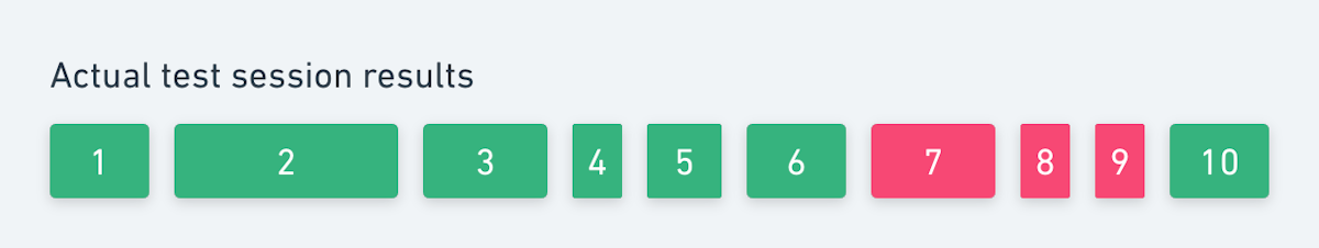
We can visualize the result of a single session like this. Each block represents a test. Green means the test passed when it originally ran, and red means it failed. Wider blocks took longer to run; narrower blocks took less time.

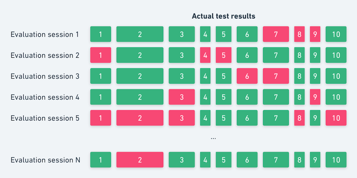
Of course, there are multiple sessions in the evaluation dataset, which we can visualize like this:

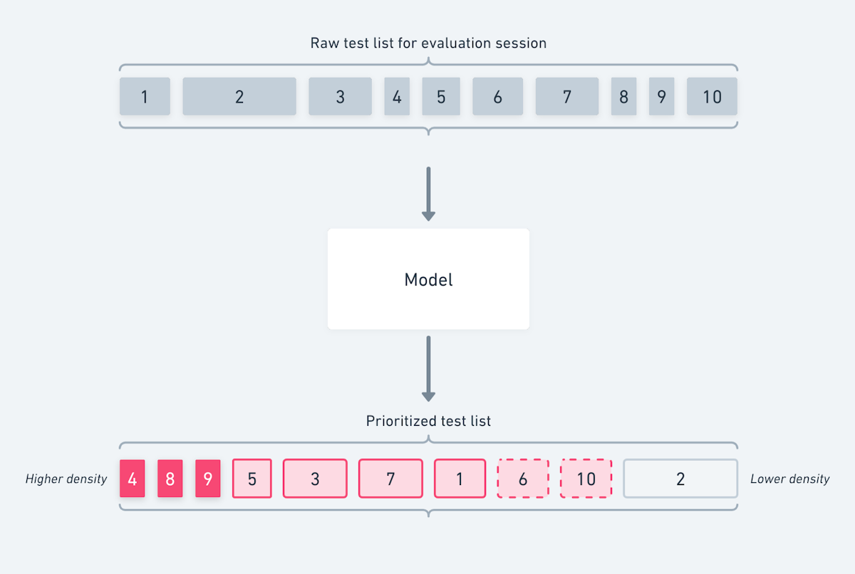
Then, for each session in the evaluation dataset, we ask the model to prioritize all the tests from that test session and build combination (see How Launchable selects tests).
The model returns the list of tests prioritized by failure density, i.e., how useful this test is at finding failures per second of test execution time.
Visualizing this process, again using a single session:

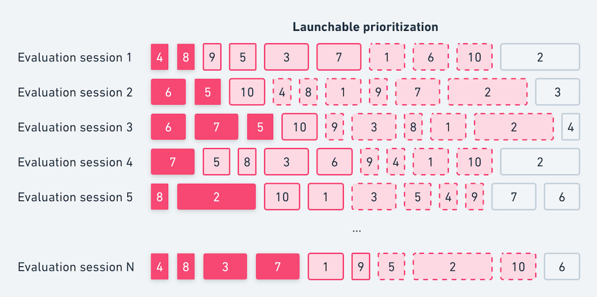
And again, in aggregate across all our evaluation sessions:
The important thing to note is that the model hasn't "seen" these test sessions before - they were not used for training - but we know which tests passed and failed because we have the full results! This lets us compare the actual test results for that session against the model's prediction of which tests had higher failure density. This tells us that -- for this session, at least -- Launchable can find a failing session by only running a small subset of tests:

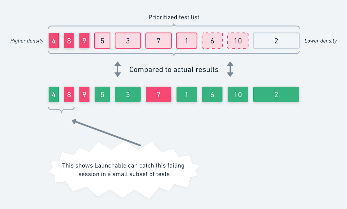
One failure is enough if we're looking for test session failures (i.e., will the tests pass or not?). It only takes one failing test case for the whole session to fail. When choosing an optimization target, we need to run enough tests to not mark a session as passing when it would actually fail if you run the full suite. That's the definition of confidence.
We can see Launchable's aggregate performance by stacking a bunch of evaluation sessions together and seeing how long it takes to find a single failure. Sometimes Launchable's prioritization of an evaluation session will find the first failure earlier, whereas other times, it'll find it later. We can sort the evaluation sessions by how long they take, like this:

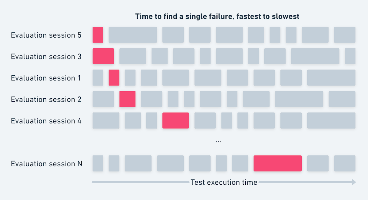
Then we can imagine an optimization target. How many failing sessions would we miss if we only ran a portion of the tests like this:


At this stage, we've run all the evaluation sessions through the model and compared the prioritization to the real results. Finally, we use this data to create your Confidence curve.
On the X-axis, we have test execution time. The upper bound of this axis is the maximum total execution time from all the evaluation sessions.
On the Y-axis, we have the Confidence percentage. This is the probability of correctly catching a failing session. When choosing an optimization target, we need to run enough tests to not mark a session as passing when the full run would fail. That's what this percentage represents.
The pink line represents the intersection of these two factors aggregated across all the evaluation test sessions. Logically, the line starts at (0,0%) and ends at ([max],100%): if we run no tests, we'll miss every failing session, and if we run all the tests, we'll catch every failing session. However, Launchable's power is in the in-between. Notice how the pink line isn't straight: it's curved to the left. This means that Launchable can catch more failing sessions in less time!
For example, the above image tells us that if we set our optimization target to 90% confidence, we should expect only to run 10 minutes of tests (X-axis) and expect to catch 90% of failing sessions (Y-axis). Similarly, if we set our optimization target to 25 minutes (X-axis), we should expect to catch 95% of failing sessions (Y-axis). Both of these are great improvements over running all the tests.